Sadly, the Pierre Bonnard exhibition for the NGV’s 2023 winter master’s event did not enthrall me. Part of this comes down to the reality of the double-billing of this exhibition, with designer India Mohdavi, who created complimentary interior design pieces for Bonnard’s paintings to be placed together. Mohdavi’s wallpapers specifically, I was perplexed by. They brought to mind my-first-photoshop-filter experiements that have somehow ended up commanding a significant amount of gallery real-estate. This was an upsetting conclusion to come to upon visiting the exhibition, having seen Mohdavi’s other work online beforehand – excited by its indulgent boistrousness, and tempered by its purposefulness and control, to maximise the immersive aesthetic effect.
I searched elsewhere to see if my feelings were mirrored.
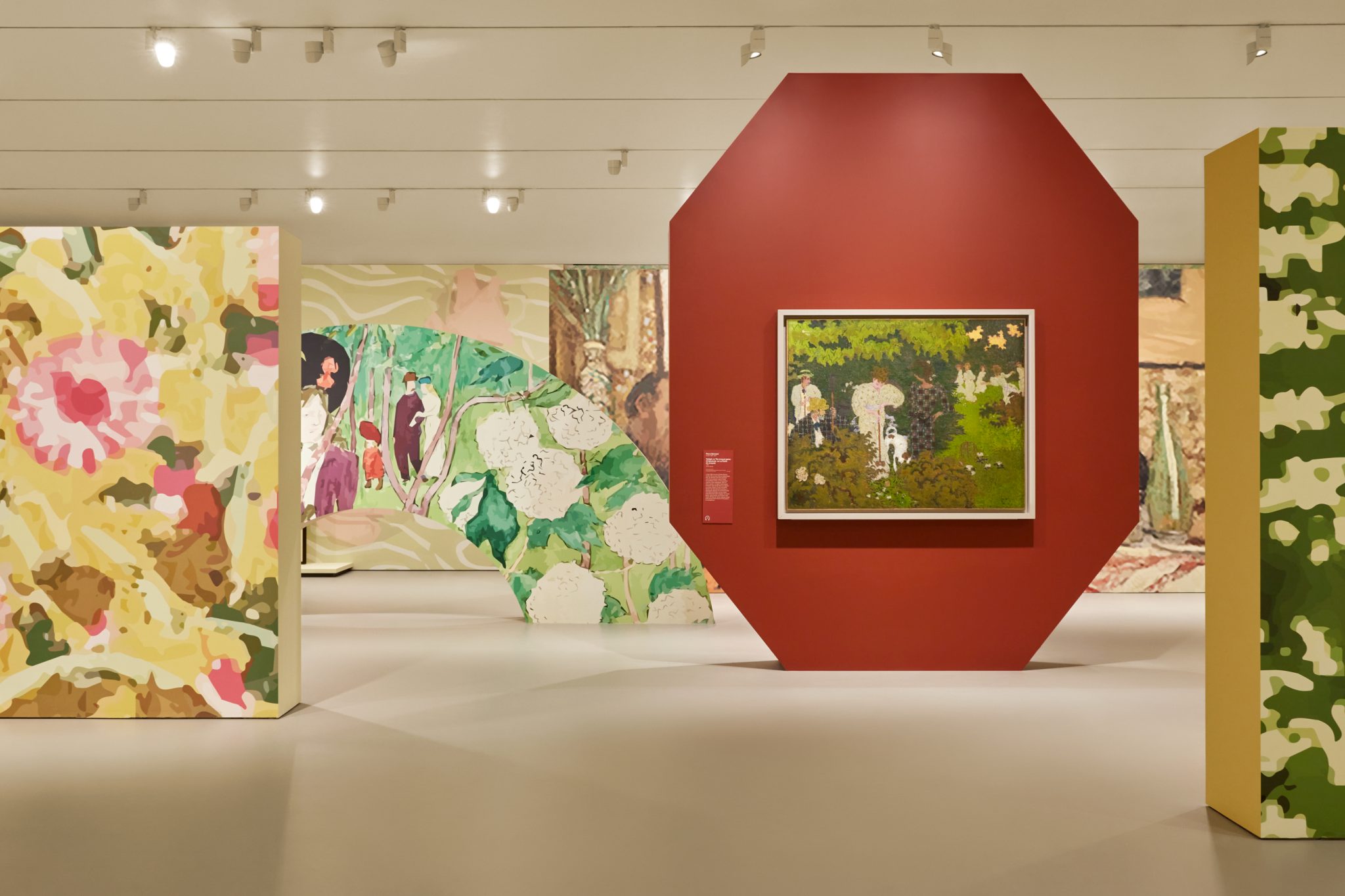
Celina Lei’s review for ArtsHub nailed the sentiment, writing, “Moving forward, it becomes clear what the show does get right is colour theory, and using this to pair with and capture the essence of Bonnard’s paintings. Mahdavi has selected hues and tones to delicately bring out details that may have otherwise not been picked up. However, the same can’t be said regarding patterns, which have been created through enlarging elements in Bonnard’s work, sometimes to a pixelated degree. In the second section of the main gallery space, roses, checkers, stripes and dots scream for attention, like in a candy factory that uses too much artificial sweetener.” Indeed, if one suffers from visual burnout, this exhibition is a trial. Bonnard’s work can be dense with misty, shimmering detail, so to place that work within a spatial kalaeidoscope of warped, pixelated fluff is madness.
Others found issue with the exhibition in ways that I think stretch the validity of useful art criticism. Christopher Bantick, writing for Victoria’s The Age, titles his opinion piece “Tutti-frutti gimmicks and the Instagram crowd: Why I’m breaking up with the NGV”, which alone should clue one in to the proceeding old-man-weeps-because-phones tone of the piece. He writes, “While it’s likely the latest addition to the Winter Masterpieces series will continue this trend of high participation, the NGV has sold out by prioritising entertainment over knowledge.”
It is rather quaint to see entertainment and knowledge as opposing entities – information, history, and philosophical concepts that contain jokes, self-effacement, and colour, delight me, and I’m afraid that does not give Christopher cause to label me as not a “serious art goer”. In the Bonnard show, the NGV has achieved one thing above all else – alienating serious art interest. He continues, “It is imperative the NGV rethinks its actual position as an art institution. Justifying itself with high visitor numbers at the cost of deepening fine art awareness in this city and beyond matters. As a friend who saw the exhibition said to me recently, ‘I no longer belong to this world.’”
This is quite a serious accusation, and one that I disagree with. Sure, I think it is important that we critique blockbuster style exhibition programming as the money grabbing that it is. But also, people are excited by an art space? That’s a tremendous thing! Feeling welcome in a gallery, rather than, to borrow a word, “alienated” by academic wanna-be aristocrats? An important trend to continue building upon! Fuck the elitism.
There is an opportunity to create balance here – to bring in the people excited by aesthetic pleasures (who, quite frankly, have a place in the museums audience as important as any scholar – let us not return to the pathetic exclusionism of museums of old), and enable avenues of experience that go beyond exhibition-as-marketing-tool. Showcase young Australian artists in this way! Prompt moments of critical engagement where possible! Goodness knows the the budget to experiment with an idea like this is immediately accessible. For the briefest moment, I will choose to sympathise with a small aspect of Christopher’s concern; I do find that as I walk through a gallery, I prefer not to have to side-step around a hundred phone cameras pointed in various directions and perhaps some events should have times carved out for a phone-free experience. But if selling tickets to people sharing international art online is what brings (pays for) that art to the country and the people, I’m afraid that I’m going to have to call Christopher, as we say in “serious art goer” circles, a whiney baby.
Returning to the real problem, India Mohdavi’s wallpapers are, miserably, pixelated mush. They are, by most designer’s standards, aesthetically quite ugly. They are digital blobs that lack interest, detail, and most importantly, authenticity. Mohdavi becomes authentic when her choice of wall colour comes into play, or her inviting couches are placed in front of Bonnard’s dreamier works. They feel natural and confident. Importantly, they feel finished. But the wallpaper, and image-approximations of Bonnard’s floral inclusions and human figures, are like staring into a highschoolers digital media portfolio – the heart is in the right place, and the aspiration/inspiration is true, but the execution lacks maturity. Which I take no pleasure in writing, given the way Mohdavi seems to showcase both how to have fun with interior design, while demonstrating how to execute it with that refinedness that comes with designerly maturity. Her seating and tabling products are nostalgic but tasteful, her various floral explosions on wallpaper, couches and stools are busy, but balanced through colour. Stimulating, but careful. That care is hard to find in the Bonnard exhibition. Her choices for the single colour walls I think were most effective – they are unobtrusive, but still enable the enhancement of the dreaminess that wafts from Bonnard’s later works. Were the entire exhibition designed in this way, the result would be more subtle (and less of a double-billed pairing of artist and designer), but more focused, less muddied.

Leave a comment